Sunday, April 17, 2011

Moxie Fab Balloon Card

Okay, just saw this challenge over on the Moxie Fab blog, and new I had a few Hot Air Balloon cards I had made that I never linked up to any challenges.  So no time like the present:

Thanks 4 your time!

Color Cue {14} Challenge

When I saw the colour combo for Dawn's Color Cue Challenge #14, I knew I wanted to use the glitter red foam sheets I picked up at a Dollar store and my new Spellbinders die (my first set!!).
Eeek--when I look at what I created, all I can think of is The Wizard of Oz--think: Dorothy's Ruby slippers and her "wish" is "There's no place like home!".  If only I had some aqua blue gingham paper to mimic her dress!
I only used ONE stamp on this card--the dots on the card base--I can hardly believe it myself!  LOL!
The sentiment is an SRM sticker--my fabulous blog friend Virginia has been designing for them for a while, and I've seen the fabulous cards she's made with them.  So, I finally picked some up last weekend at Scrapfest at the Two Scrapbook Friends booth! 

 Well, just a warning, I think you'll be seeing a lot of that glittery foam on many upcoming project!! I got them in quite a few colours!

{ Click on Home, and scroll down to see my 2 other challenge posts from today! }

Thanks 4 your time!

Totally Hues Challenge #6

I've been following Heather Pulvirenti's blog for a while.  She combines colours so well and her creations are always inspiring!  She started a colour challenge a while back, but I haven't had the chance to play along {correction--I have played along, but never post by the deadline}. . . until now !!  Here's the combo for her current challenge #6 {Lemon Tart, Aqua Mist, Simply Chartruese & Raspberry Fizz}

Given we're one week away from Easter, I thought I'd make another Easter card. I stamped the card base with a dots stamp from Verve.  Then I ran a scrap of green cardstock through with my Swiss Dots embossing folder. Before layering that on top of some vellum and stitching it onto the card base. I stamped a flourish (a stamp so old I don't even remember the manufacturer) a few time with Versamark ink.

I used some more of my Prima flowers, and made the brad by stamping the same flourish on some Lemon Tart scraps, punched it out, and added it to an old brad with an Epoxy dome sticker.  Stamped the PTI Mexa Mixed Messages sentiment onto a scrap of Aqua Mist, trimmed with decorative scissors, distressed lightly with DI Walnut Stain, and tucked under the flower with a loop of soft yellow ribbon.

So glad I finally got to join in one of Heather's challenges!

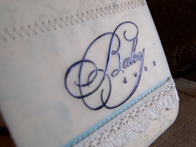
Since I had some vellum out, I also made this uber soft baby boy card.  I stamped the sentiment on vellum before stitching it to the card base I had stamped (in Powder Blue) with an old small floral damask stamp I have (I think Studio G)--trying to bring out and use the old stuff I had forgotten about!
 I heat embossed the sentiment (before stitching) with some metallic blue embossing powder.  It adds the perfect shimmer and depth to a card that is very light.  I'm thinking it will be perfect as a Christening card.

Okay one more post to got today!  I think this will be a record!

Thanks 4 your time!

Embellish Challenge w/ Crochet Trim

Hi all!  Hope you're having a great weekend!  My wonderful in-laws picked up my boys yesterday to spend the day with them--for me that meant time to clean the house, work on my report cards, and have some crafty time!!!!  I worked on a few colour challenges; the mojo was kickin'!!!

First up (you can check my other posts from today for other challenges) is Embellish's Crochet Trim Color challenge.  Turquoise/Aqua are my favourite colours, so when I saw this combo with yellows (a combo I had never tried before), I was completely drawn to it!

I used my favourite wPlus9 Pointsettia Patterns stamp set (I seriously cannot put that set down!) to create the background which I then heat embossed to add some dimension and shimmer.
I then stamped the PTI "Mother" from Mega Mixed Messages repeatedly on some soft yellow cardstock using TeaDye Distress Ink, and then distressed the edges with the same colour.  I stitched that piece and the crocheted trim on the card base.  Then I added the layerd Prima flowers (which I've had for over a year and had not used yet) with a button and some floss.
The final addition was the "You're the Best Ever" sentiment from PTI's Big Bold Wishes set, which I stamped onto a scrap of Vintage Cream and popped up with foam adhesive.  I love how the whole card turned out.  I've been trying to step out of my go-to layouts, and this off-centred yellow panel was my attempt at that!

Since I had the flower from my Pointsettia Patterns inked up, I also made this card [totally different colour combo].  I tried the new Nellie's Choice die set I picked up at Scrapfest last weekend!!  And I pulled out my other favourite stamp set--PTI's Delightful Dahlia for that flower focal point.


Okay, off to post my other challenges!!

Thanks 4 your time!

Friday, April 8, 2011

CR84FN22 Challenge

I had to make a couple Sympathy cards this past weekend--a friend of mine from work needed some.  She told me that the recipients and deceased loved nature; so, when I saw the colour for the CR84FN22 challenge, it was easy to come up with the following cards.
A closer look at the heat embossed flowers
 Loving this brocade embossing folder . . .


Sorry--short post--on a date night with my hubby tonight--wanted to get this posted before the deadline!!
Thanks 4 your time!

Saturday, April 2, 2011

Easter Egg Shaped Card

I'm submitting this card to the current Create CARDS blog challenge--Easter Cards
This week's Wednesday Card Challenge over at the Two Scrapbook Friends forum was to create a shaped card . . . so I joined the two challenges and came up with this Easter Egg-shaped card.  I'm pretty pleased with how it turned out!!
 That glittery strip in the centre looks so much more "sparkle-y" IRL.

Thanks 4 your time!

Color Cue {13} Challenge

I've been letting the current Color Cue colour combo sit with me for a while . . . lots of ideas fluttered through my head.
Finally, these are two that I came up with . . . so far . . .

 I can't put down wPlus9's Poinsettia Patterns--I LOVE it!!  I heat embossed the pattern in white onto soft yellow.  I also used one of the small stamps from the set to create the brad for the flower.

For the second card, I used my new Kassie's Brocade embossing folder for this lovely grey panel--I LOVE the texture!!  The card base is PTI's Spring Moss colour--a bit washed out in this photo.  I used the "for you" and "MOM" stamps (from wPlus9's Woodgrain Silhouettes set) repeatedly to create a subtle background on the cardbase.
 Here's a close up of all the mixed textures--embossed panel, lace, stitching and soft pearls!!

I'll being doing another post right after this one showcasing an Easter Egg shaped card that also features the Poinsettia Patterns set--so stay tuned!!

Have a great weekend!!  I'm going to try enjoying the somewhat warmer weather and hopefully some crafty time too!!

Thanks 4 your time!

Sunday, March 27, 2011

CR84FN21 Challenge

I really should be doing some school work, but couldn't resist playing with CR84FN21's challenge

The moment I saw the inspiration photo, I couldn't stop think of all the combinations and layers I would use.  I knew I wanted to make a wedding card, and I knew I wanted to play with my new Cuttlebug---YES, I finally got one!!!!  Any way, here's what I came up with:
 I found some gorgeous appliques used for dresses at a thrift shop--a whole bag full of it for less than $3.  I knew when I saw it that I could incorporate some of it into wedding cards.
 You can see how that applique adds a bit of sparkle with the pearls and sequins.  The flower adds lots of texture too!

Okay--enough prograstinating . . . I really got to do my school work (arghhh).
Have a great Sunday!!
Thanks 4 your time!

Saturday, March 26, 2011

CARDS challenge--Use a Grid

The current CARDS challenge is to use a grid on your card.  This is the card I've submitted--my quilt uses a grid pattern!
Little one just went down for a nap--gotta try to get some work done around here!!  . . . or maybe just procrastinate and craft instead! LOL

Thanks 4 your time!

Friday, March 25, 2011

Why does my Purple look Blue?!?!

This week's CR84FN Challenge has one of my favourite colours . . . purple!

If I were to do my wedding all over again (to the same wonderful man, of course), I'd go with that deep purple.  I did go with a silvery lavendar, but the colour of those dresses in the inspiration pic is so rich and beautiful!

Any way . . . when I saw these fab colours, I knew I wanted to CASE this stunning card by the amazing Joy Taylor (you've MUST check her blog--her work regularly makes my jaw drop!)


I really loved how Joy made this hydrangea POP, and I also loved the text behind the stunning flower.  So, I created the following card: 
The only problem is that when I went to go photograph it, the flower appears blue.  I SWEAR, in real life, the flower is purple and lavendar.  I used purple markers and a grey toned Copic (don't own any purple Copics yet) to colour in the flower.  However, no matter what setting I used on my camera, or what lighting I used, that darn flower appeared blueish--eeesh.

So, I thought I'd also submit this card for the challenge.  I made it a while back.


I hope I get some time to craft this weekend, but I think I'll be spending most of it grading my students' assignments :( 
 

Thanks 4 your time!